How intentional recommendations drove +77% engagement for 4.7M users.
Problem
Let's get the page to live up to it's name 'For you'
The Reality of the Jira ecosystem is that 50% of all sessions start on the For You page. This makes it one of the highest leverage surfaces we own, yet it was also one of the most publicly criticised. Within the Problem Space, our Observed Behaviour was clear: customers had been asking for meaningful personalisation for years, but what they were getting instead was a surface that produced noise and sent 56% of users dropping off immediately.
As the sole Product Designer driving this project, my mandate was to turn "For You" into a surface that actually helped users prioritise work, reduced context switching, and unlocked the kind of AI driven productivity that kept people coming back.
Constraints
Let's set some boundaries Designing at this scale meant balancing a high-level product strategy against the gritty reality of technical limitations:
The AI Paradox
We needed dynamic, smart recommendations to feel "personal," but we couldn't break the user’s conceptual model. If the recommendations were different every time a user refreshed, the tool would feel unreliable and there would be no desire to return.
The "Infinite Feed" Trap
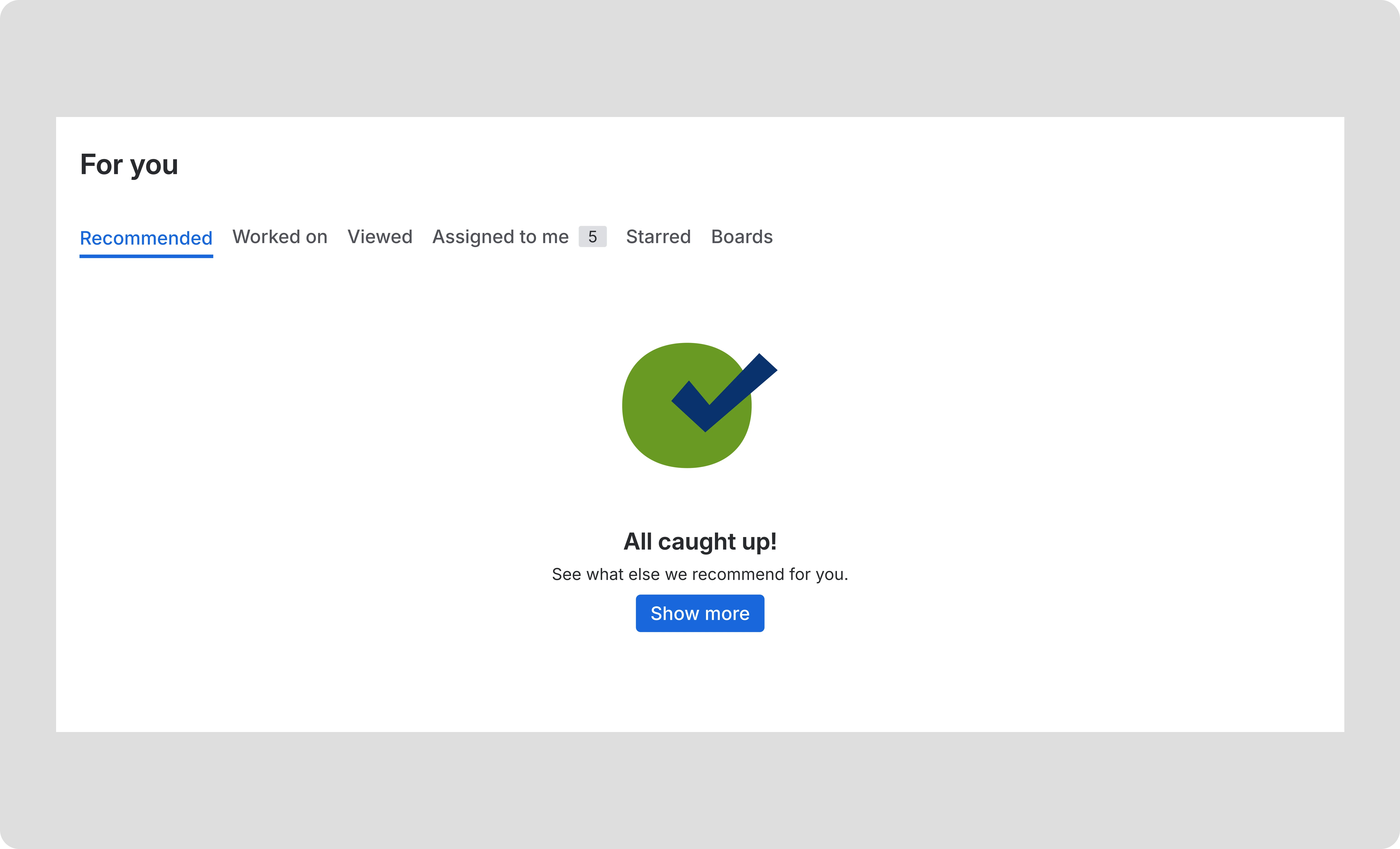
There was a constant pull toward a social-media-style feed. However, Jira users aren't here to browse; they are here to execute. I had to fight for a design that allowed for a sense of completion, not an endless scroll of data.
approach
Stop collaborate and listen
To move from an ineffective landing page to an intentional home base, I led a process grounded in rationale and cross craft collaboration.
Anchoring through discovery
I dived into research and competitor patterns to understand the behaviour behind user drop offs. By exploring how to balance dynamic content with a stable UI early on, I moved the focus from just "managing noise" to driving collaboration. This ensured we didn’t settle for the first technical solution.
Defining the Interaction Structure
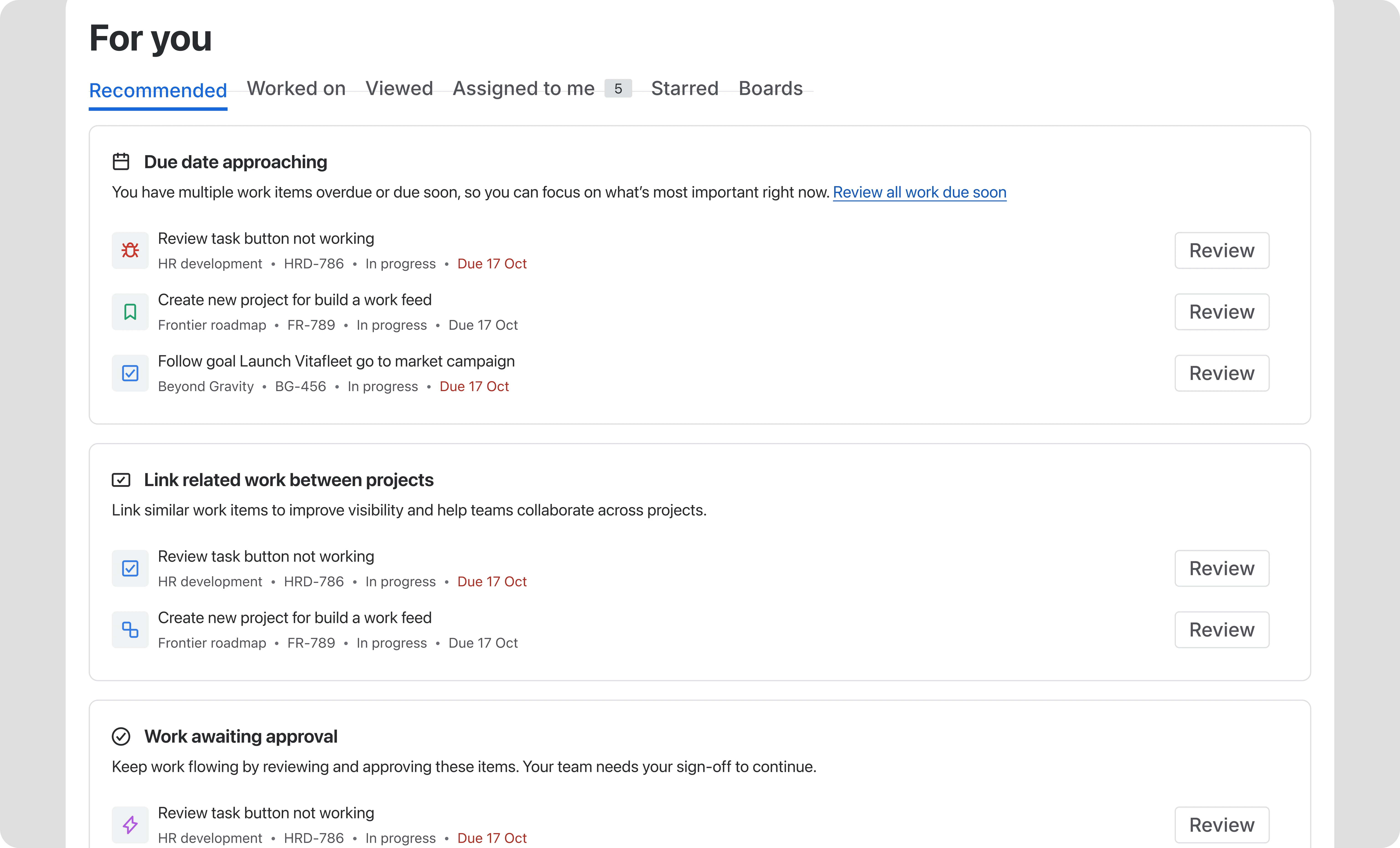
I solved the randomness of AI by creating structured categories to group work logically. By defining this underlying Interaction structure early, I ensured the page layout felt familiar every time a user landed on it. The UI became a predictable framework that could house unpredictable, dynamic content.
Designing for Surface and Flow
To keep users in their flow, I deliberately set limits on these sections. This curation ensures that the surface of the product doesn't overwhelm the user. It allows them to focus on their most important tasks, complete them, and walk away with a genuine sense of accomplishment.
Collaborative sparring
Throughout the project, I shared these concepts early and often with the engineers and product managers. I made sure every interaction had a clear reason and precedence behind it before we moved into the final build phase.
Solution
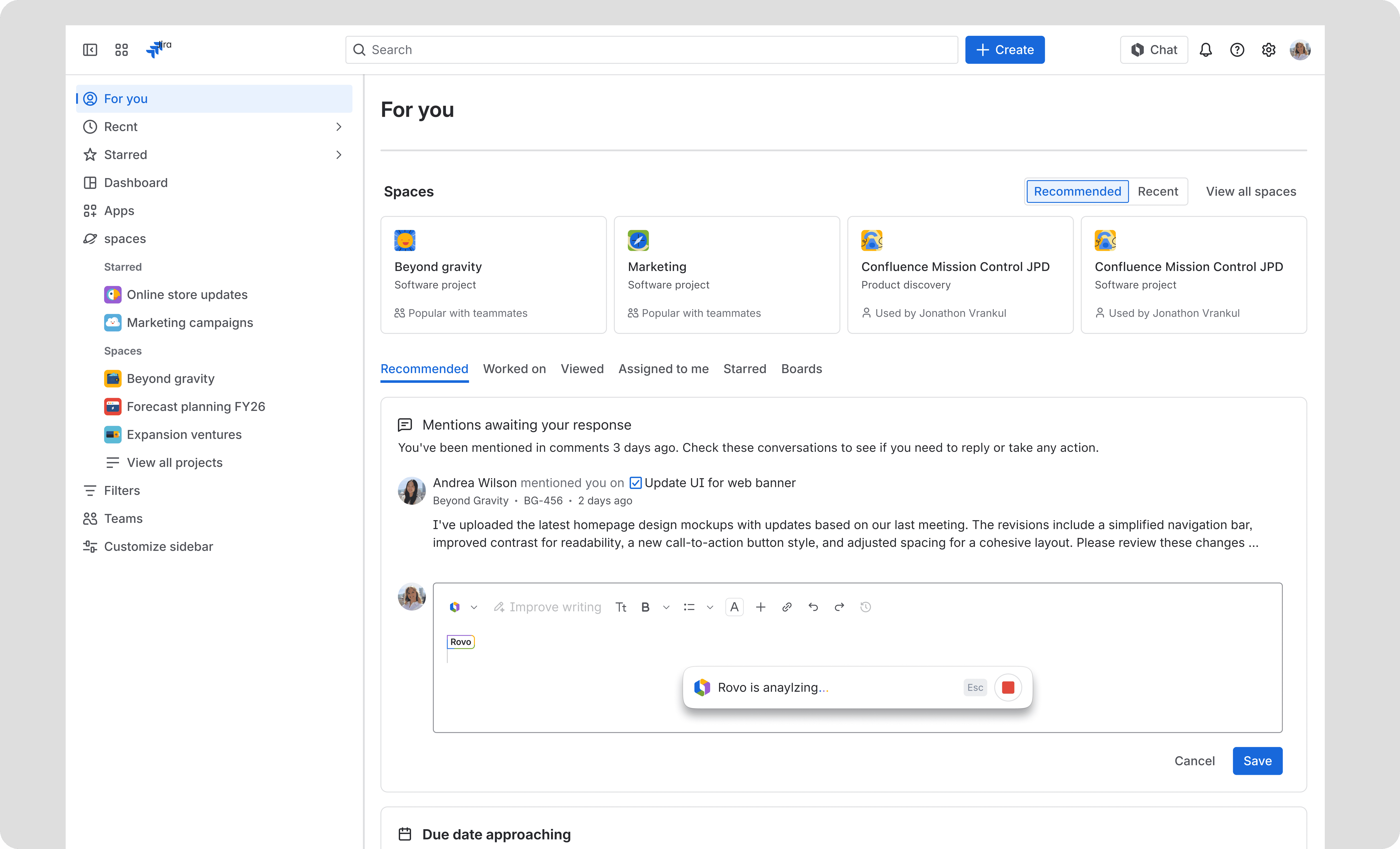
A purposeful landing page
Structured sections ensure the page feels predictable and relevant every time a user lands on the page.
Focused UI
We swapped the endless scroll for curated cards, giving users a clear path to getting their work done.
Progressing work inline
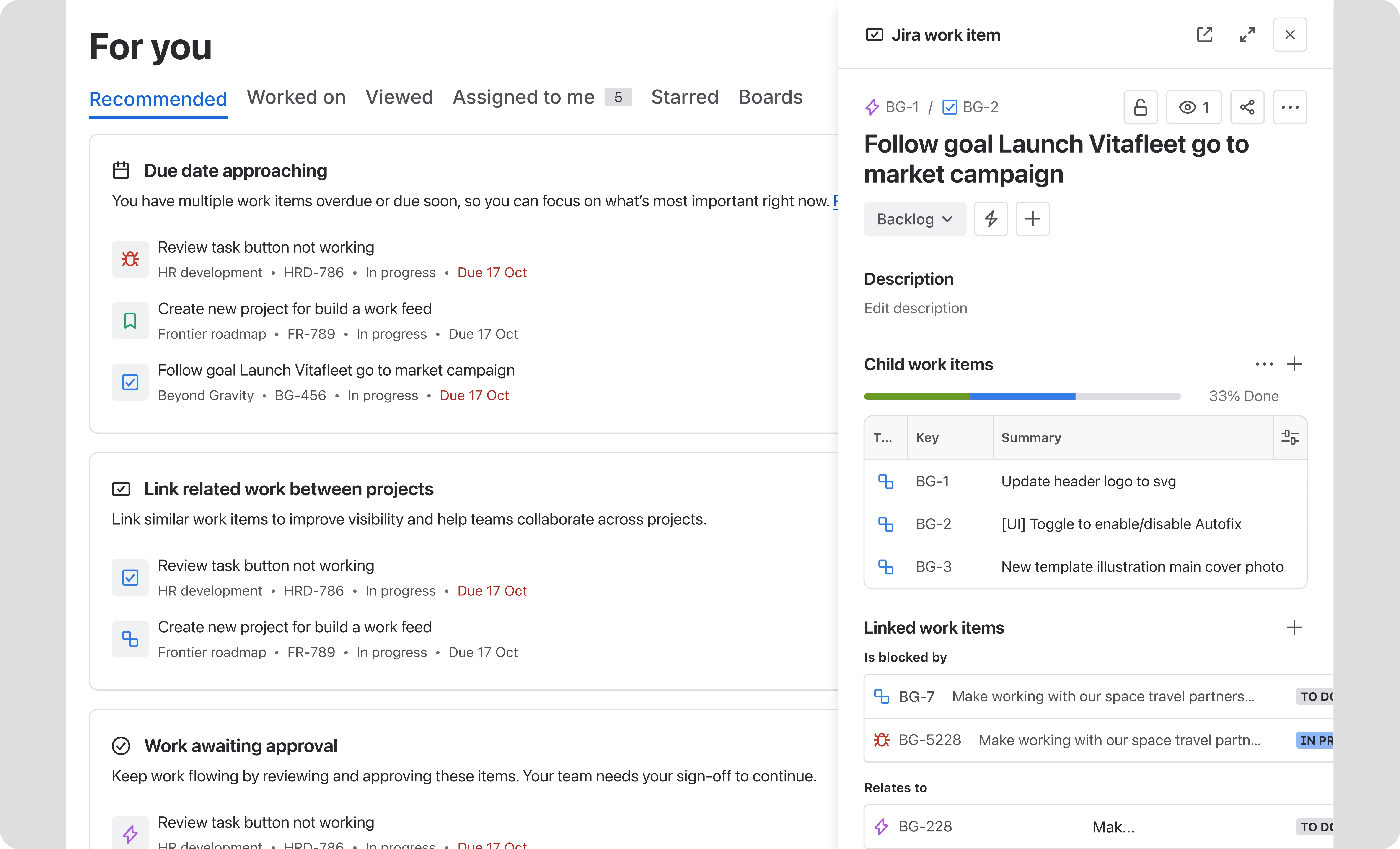
I designed ways for users to update tasks directly from the home tab, cutting out unnecessary clicks and navigation.
Outcomes
Personalisation for the win!By anchoring the design in rationale and curation, we didn't just stop the drop off; we turned the "For You" page into a preferred starting point for work.
+90% interaction with suggested work
By evolving from basic links to high value cards, we nearly doubled the rate at which users interacted with our recommendations.
+77% increase in page engagement
This massive jump in users spending 5+ seconds on the page proved that the content was finally relevant enough to hold their attention.
+40% boost in project discoverability
Driving more users to "view all projects" helped teams realise the full breadth of work happening across the business and break down silos.
+8% retention on the 'For you' page
A significant increase in users returning to the page daily, signalling that the new experience had successfully become a natural, reliable part of their daily workflow.